With everything going on right now, it can be tough to cope with being at home more often. What is there to do after watching all the cute dog videos, taking your (third) daily nap, re-watching Parks and Rec for the millionth time, and scrolling through your feed endlessly? Pick up a new hobby! May I suggest getting in tune with your cooking side and check out these best Texas food bloggers.
Everything is bigger and better in Texas (fact) and our food is definitely one of those things. Luckily, Texas has no shortage of talented food bloggers ready to give us a helping hand in creating a variety of mouth-watering recipes throughout the year. Using our rating scale, we researched and found the 6 best food bloggers in Texas to help you find your new favorite recipes and help you become a better cook. (Disclaimer: We are not responsible for any weight gain you experience from trying out these out these awesome new recipes).
Each blogger’s website was judged on 8 separate criteria including; Design & Aesthetics, Ease of Navigation, Loading Speed, Experience of Ads, Quality of Photography, Ease of Reading the content, Author’s personality, and the Consistency of Their Posting New Content. Along with bonus points awarded for various things, a perfect score would be 100 points.
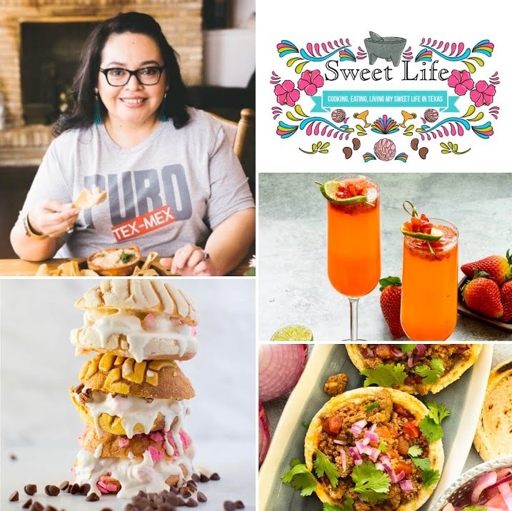
1. Sweet Life

Total score: 86.2 / 100
Lives in: South Texas
USER EXPERIENCE
Design/aesthetic 12.5
This blog has a simple, clean look that makes it appealing and easy to look at. The blog’s logo is also well done – colorful, fun, and unique without being over the top. The logo showcases the blog’s and Rodriguez’s personality well. The blog posts on the home page are also structured cleanly making it easy to browse.
Easy navigation to find recipes 12.5
Rodriguez’s blog has a clear search tool for finding any specific recipe you are looking for. In addition to this, her recipes page is segmented into different types of dishes (appetizers, breakfast, entrees, etc.) so even if you don’t know exactly what you’re looking for, you can still easily browse a recipe to make.
Loading speed 5.7
PageSpeed Score: (28%)
YSlow Score: (63%)
Average score of 45.5% = 5.7 of 12.5 points.
Ad experience 10
In all, I only counted 3 ads on the homepage and nothing popped up. As for the recipe pages, there are about an average of 6 per recipe page but mostly on the outskirts of the page. The ad experience is not overbearing and they fit nicely into the design of the blog without taking away from the overall pleasant user experience. The only distraction is the ad smacked right in the middle of the recipe card.
CONTENT
Easy-to-follow 10
Recipe wording is simple yet specific. The opening paragraphs before the recipes often give helpful hints but if you don’t want to read it, you will still have all the necessary instructions in the “recipe card” section at the end of the page.
Photo quality 10
While there are not step-by-step photos, high-quality photos of the finished recipes are included. The photos are aesthetically pleasing and look well planned out.
Author personality portrayal 12.5
Vianney puts her personal twist on every post and often reflects on her family history/traditions and travel experiences. You can tell when a recipe is special to her which gives this blog a unique, authentic feel.
Post consistency 10
Vianney seems to post articles consistently around 2-3 times a week.
BONUS
+3 points for having a Spanish version of her blog available. A bilingual reina.
2. Joyful Healthy Eats

Total score: 84.4 / 100
Lives in: Houston, Texas
USER EXPERIENCE
Design/aesthetic 11.5
The homepage is clean, colorful, and intrigues the reader to browse around. It has a simple design, yet many different features which are formatted together beautifully.
Easy navigation/Easy to find recipes 13.5 (12.5 + 1 bonus point for additional filter options)
I really enjoy the search and filter function of this blog. Not only is there a convenient search bar, you can also search through the recipe index by broad categories and even go further and filter by specific type of food within the category. For example, within the “breakfast” category, there is the option to filter by eggs, french toast, muffins and baking, oatmeal, etc. You can also filter by different diets.
Loading speed 5.4
PageSpeed Score: (30%)
YSlow Score: (57%)
Average = 43.5% = 5.4 of 12.5 points.
Ad experience 7
On the homepage was only 1 ad on the bottom of the page which could be exited out. The recipe page is a whole other story. On one recipe alone I counted 10 ads, some on the outskirts of the page, one video popup, and multiple in the middle of the recipe which broke up the flow. It did make the page load slower than usual.
CONTENT
Recipes are easy to follow 12.5
In the paragraph before the recipe, helpful tips and tricks are provided in extreme detail which is convenient for not only beginners but to a cook of any experience. On the recipe card, simple language is used and instructions are short and numbered.
Photo quality/amount 11.5
Photos are amazing quality and a good quantity (about 5 per recipe + typically 1 video). No step-by-step photos but it comes pretty close with helpful guidance.
Author personality portrayal 9
She is open, honest, and positive. She also sometimes shares about her family and experiences in her posts.
Post consistency 8
Recipes are posted about 1-2 times a week.
Bonus
+3 points for a convenient print button on the recipe card
+3 points for a “Jump to Recipe” button
3. Easy and Delish

Total score: 84.3 / 100
Lives in: San Antonio, Texas
USER EXPERIENCE
Design/aesthetic 9
The homepage is simple and clean. Recipe formats and thumbnail quality are consistent. The logo is simple but not differentiating.
Easy navigation/Easy to find recipes 12.5
The search function of this blog has many unique aspects. In addition to being able to search for a specific recipe, you are also able to filter by the latest, popular, diet-specific, or related recipes. If you have an account, you can also filter by your favorites.
Loading speed 4.8
PageSpeed Score: (25%)
YSlow Score: (52%)
Average score: 38.5% = 4.8 of 12.5 points.
Ad experience 9
On the homepage is only a handful of ads.The recipe page has about 7 ads. They are a little disruptive but do not take away from the overall functionality of the page and they are placed apart well.
CONTENT
Recipes are easy to follow 11
In the introductory paragraph, she also shares suggestions and alternatives that allow a cook to truly make the recipe their own. She also answers possible questions one might have which helps make the cooking process easier. The recipe card is simply worded and has numbered steps.
Photo quality/amount 11.5
Not only are there great quality step-by-step photos, Denise also includes helpful info-graphics which are great tools. For example in her collection of freezer recipes, she shares a freezer storage guide and a guide of foods not to freeze.
Author personality portrayal 12.5
Denise is a proud mother and Brazilian-native. In her posts she’s not afraid to show her mom-side and use her Brazilian heritage to create unique recipes that work for other people who value healthy, delicious food on a budget. Through her recipes, her personality definitely shines through.
Post consistency 8
New recipes are about posted 1-2 times a week.
BONUS
+3 points for a “Jump to Recipe” button
+3 points for a convenient print button on the recipe card
4. Homesick Texan

Total score: 81.2 / 100
Lives in: Dallas, Texas
USER EXPERIENCE
Design/aesthetic 12.5
The website design is clean, functional, and eye-catching. The homepage is set up in a way that intrigues the reader to browse around because of the logical flow and high-quality, eye-catching photos.
Easy navigation/Easy to find recipes 11.5
Navigation is simple and easy. Recipes can easily be searched or browsed by a wide variety of categories or if you’re looking for a specific recipe, there is a convenient search bar available. Unfortunately, some recipes are only available through a subscription which limits accessibility but, per the website “everything published before 2019 is still available to all.”
Loading speed 4.2
PageSpeed Score: (12%)
YSlow Score: (55%)
Average score: 33.5% = 4.2 of 12.5 points.
Ad experience 12
On the homepage are 4 small and medium non-disruptive ads. On the recipe pages, there are about 3 medium sized, non-disruptive ads. Overall, a good ad experience.
CONTENT
Recipes are easy to follow 10.5
Recipes have simple language and a simple format. They are easy to follow for a cook of any experience level.
Photo quality/amount 10
Photos are of great quality and eye catching. While step-by-step photos are not included, there are about 2-3 photos that show some progression of the recipe which do help.
Author personality portrayal 12.5
This 7th generation Texan (Lisa Fain), is a proud Texan and it shows. Before each recipe, she shares her experience with the recipe or how she came about it. She usually ties it back to her experiences and is always unapologetically Texan. We are happy to have her back in our great state and no longer homesick.
Post consistency 8
Recipes are posted about 1-2 times a week.
5. A Pleasant Little Kitchen

Total score: 77.8 / 100
Lives in: Dallas, Texas
USER EXPERIENCE
Design/aesthetic 7.5
The web design is simple and elegant. The homepage is just a one column list of recipes which, while clean, does not make the reader want to browse around.
Easy navigation/Easy to find recipes 9
There are a variety of types of recipes to choose from including appetizers, breakfast, pasta, sweets, and more. If you’d like you can also scroll through the complete recipe list. Unfortunately, there is not a search bar to look for a specific recipe.
Loading speed 5.3
PageSpeed Score: (35%)
YSlow Score: (50%)
Average = 42.5% = 5.3 of 12.5 points.
Ad experience 12.5
There were only 2 ads total I counted on the homepage and only 2 ads on the entire recipe page. Overall, very pleasant (and minimal) ad experience.
CONTENT
Recipes are easy to follow 12.5
Recipe wording is simple and straight to the point. Instructions and ingredients are numbered which breaks up instructions into smaller, more digestible pieces. She provides straight-forward, helpful notes on equipment and ingredients involved.
Photo quality/amount 10
Photo quality is great. While step-by-step photos are not included, there are a handful of process shots included which provides some guidance.
Author personality portrayal 11
While some recipes do not include an introductory paragraph, the ones that do let Rebecca’s personality shine through. She sometimes talks about her family history and personal experiences that inspire her recipes. For example, in her most recent recipe, she works with her daughter to make a kid-friendly scrambled eggs recipe.
Post consistency 10
Articles are posted consistently about 2-3 times a week.
6. Chilean Food and Garden

Total score: 77.6 / 100
Lives in: Houston, Texas
USER EXPERIENCE
Design/aesthetic 8
The homepage is clean, fun, and encourages browsing. The page is structured well and contains a variety of aspects. Unfortunately, it does lose points for limited sections / menu options. The only menu options are “Chilean,” “Savory,” “Sweet,” “Houston gardening,” and “Español.” No traditional menu options are available.
Easy navigation/Easy to find recipes 7.5
Recipes are separated into 3 different categories – Chilean, savory, and sweet. Within those categories are a wide variety of smaller categories. Unfortunately there is no search bar and recipes are shown only with their picture and no name (the name only shows up when you scroll over the photo.)
Loading speed 4.1
PageSpeed Score: (0%)
YSlow Score: (65%)
Average = 32.5% = 4.06 of 12.5 points.
Ad experience 8.5
There is only one ad on the homepage and it was inconveniently placed right at the top of the page above the blog’s logo. Not a great first thing to see. On the recipe page was another ad right above the content. Overall, there are about 5 ads per recipe page – 3 disruptive right in the middle of the recipe page which break logical flow. Not too overbearing but a bit disruptive.
CONTENT
Recipes are easy to follow 12.5
I really enjoy the structure of her recipe pages. First, is a short introductory paragraph, then the recipe page, and then below that are step-by-step shots that show each stage of the recipe. It allows the reader to quickly get to the recipe before viewing the lengthy picture process.
Photo quality/amount 12.5
As I said before, step-by-step photos are provided which are detailed and very helpful. The photos themselves are well thought out and of great quality.
Author personality portrayal 11
The author’s personality is seen through her wide variety of traditional and original recipes. She also integrates some fresh ingredients that she grows in her very own garden. The introductory paragraphs before the recipes are not too long which do not allow her to showcase much of her personality but again, it is very much reflected in the recipe choices themselves.
Post consistency 7.5
Recipes are only posted once a week but there are consistently on Fridays.
BONUS
+3 points for having a Spanish version of her blog available. Otra bilingual reina.
+3 points for a convenient print button on the recipe card
Times are tough but so are we.
Wishing you all good health and well wishes that these blogs can introduce you to your new favorite recipe and more importantly, help you from eating ramen noodles for the 5th time this week.
Curious how we ranked each blogger?
We created two main aspects we believed was most important for food blogs (user experience and content), then we broke each of those down into 4 specific, significant aspects (8 total) which are all weighed equally. View the ranking scale below.
Ranking scale:
Total possible points = 100
User experience (50%)
- Design/aesthetic (12.5%)
- Easy navigation/Easy to find recipes (12.5%)
- Loading speed (12.5%)
- using https://gtmetrix.com (rounded to the nearest decimal)
- Ad experience (12.5%)
Content (50%)
- Recipes are easy to follow (12.5%)
- Photo quality/amount
- process shots, step-by-step shots, other media (12.5%)
- Author personality portrayal (12.5%)
- Post consistency (12.5%)
Bonuses (+3 points)
- + 3 points for any aspect that is not necessary for a blog but sets the blog apart and provides an enhanced experience.
- EXAMPLE: Bilingual blog, a “skip to recipe” button, etc.


![[Video] A Rainbow and Tornado Appeared Simultaneously in a Rare Phenomenon in Texas double rainbow in front of a tornado over a field of grass](https://texasislife.com/wp-content/uploads/2021/04/rainbow-tornado-texas-750x450-1-100x70.png)

